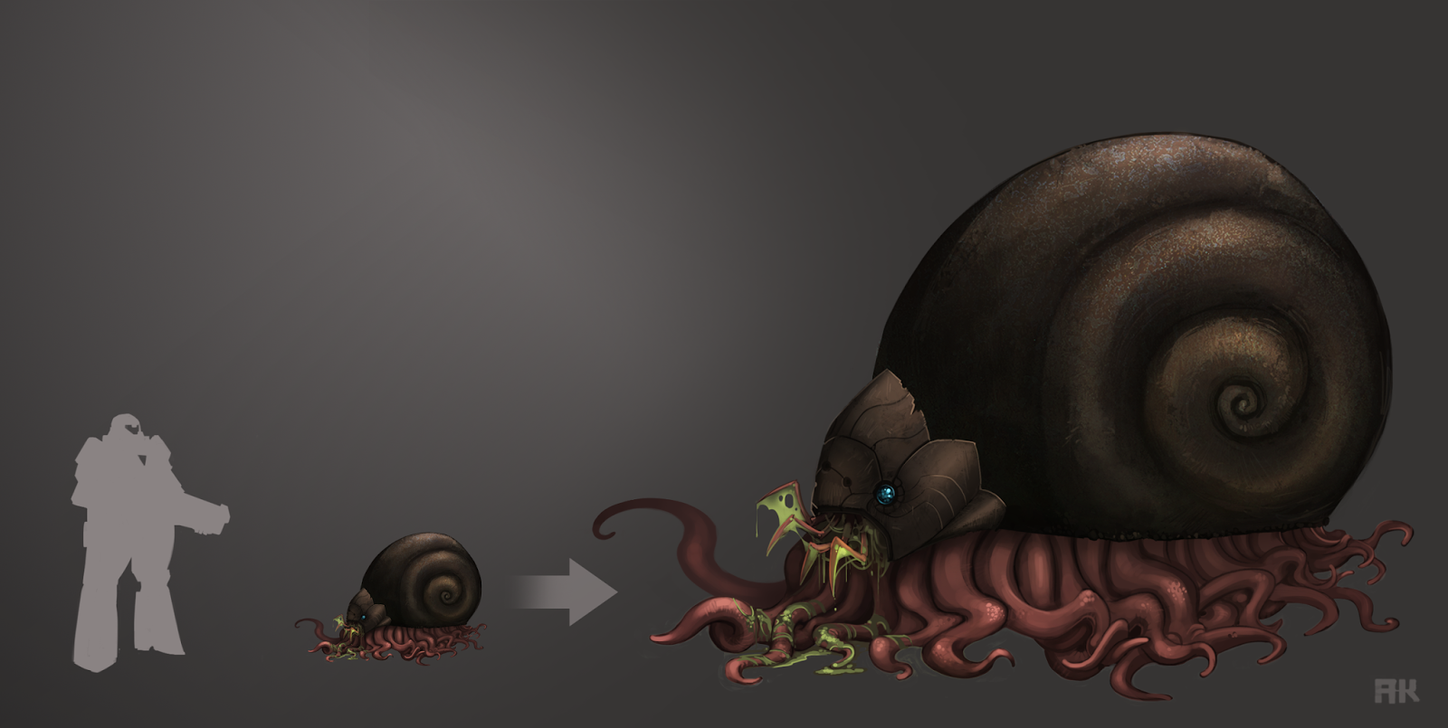
Started this concept then got busy with a contract and then came back to finish it. The final version has some changes to the mouth area, when I came back to it I wasn't crazy about the initial design in my sketches.
During this concept, the exploration of texture and color were the most enjoyable.
Once I have an idea of a creature, I try to get as weird as I can while doing the silhouettes.
Drawing a line someplace
The art of Ahed Khatib
August 3, 2014
July 16, 2014
Personal project
I've been sitting on this stuff for a while and thought it was time to share them. This is some character work I've done for my personal project which I worked on in between my contract work, it's the same project that these environment concepts are for. I've been designing a side scroller shoot'em style game that's akin to the classic Metroid, Contra and Megaman games.
Before starting the project I had never work in pixel art but I've always had a tremendous respect for the style. In the modern age of gaming with stunningly realistic graphics, pixel art has proven to be a viable art style for games and it will always have a fan base. Learning to push individual pixels has been fun but often not as easy as I expected.
This was my first animation test, I chose the simplest creature to learn how to animate. My roommate during my time at the Academy was an animator and I picked up a lot of helpful animation tips from him.


Here are some character sketches where I explored various shapes for the protagonist. I knew that a lot of detail would be lost when converting the design into pixel art so I focused on pushing the silhouette and shape contrast of the body and limbs.
These are the creature designs that I took to final polish. Although rendering these concepts to this level wasn't really necessary, I did want to flesh out these creatures to get a better idea of how they would move and interact with the player.
January 14, 2014
Concept for unannounced title
November 5, 2013
November 4, 2013
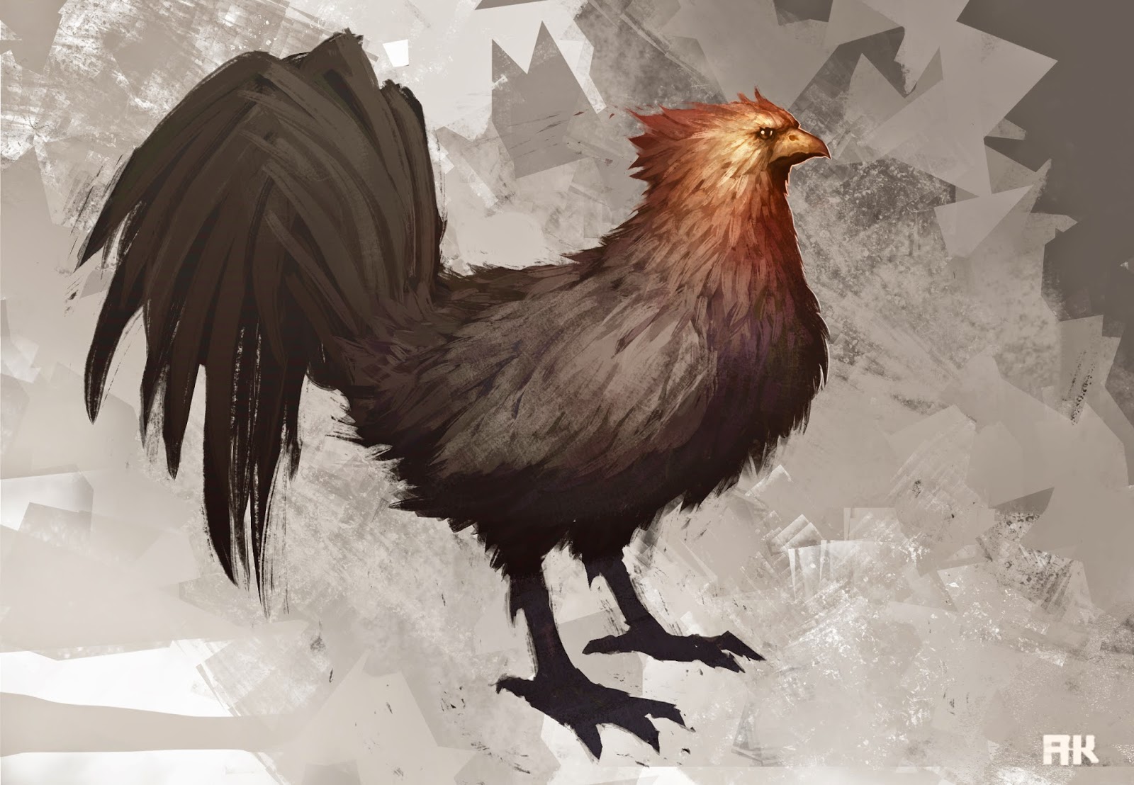
90 minute study
Finally back from the east coast and I'm getting back to work. Took a break from my project to do this quick study. I had a lot of fun working with a set of brushes that I got from shaddyconceptart.com. Shaddy is an amazing artist who is having a huge influence on my work flow, so big thanks to him and all that he gives back to the digital artist community.
September 11, 2013
August 21, 2013
August 14, 2013
Current project
These are sketches and paintings I did recently for an unannounced project I'm working on. I planned on sharing this work when I was closer to announcing the project, but I'm going through a rough patch right now. I figured I'd get back to focusing on work by sharing some of it.
The painting helped me settle on the basic shapes of the landscape, but it lacks a sense of scale. That's due to me not being sure about how large I wanted these crags to be, my indecisiveness during the painting left design issues unresolved. But I did settle on some details, contrasting shapes and atmosphere. I then went back and did some value thumbnails and this time I was thinking on a grander scale.
Once I captured just the right atmosphere and feel of the planet with my second painting, the other two paintings came along quickly. Each painting informed the next one and gave me direction. I'll post more of this project soon.
June 24, 2013
January 17, 2013
Waitress
Subscribe to:
Comments (Atom)


